DON’T DRIVE DROWSY FOUNDATION
The Don’t Drive Drowsy Foundation (DDDF) is a non-profit that focuses on raising teens' awareness of the pitfalls of drowsy driving. The DDDF was disappointed with their website at the time and desperately needed something better. What started as a website makeover became a full marketing rebrand. See the results below and what I did to make it happen.

THE LOGO & MISSION
It all started with a logo. The logo required an update that could carry the four-word name, while still maintaining the theme of safe driving. I decided to keep it simple, creating a font-specific logo with a road connecting all four words.
Once approved, it was on to the brand guide. The DDDF had a mission to tell, but it wasn’t written for all to see. I copywrote their mission and vision, and assisted in brainstorming new colors and fonts, bringing together a brand guide that they could use for future creatives.

THE WEBSITE
In working with DDDF to determine goals for the new website. Not only did the design need to be updated to match the new brand, but the site structure, navigation, page layouts, and content hierarchy needed to be remapped to communicate their drowsy driving message. I also added a donation button, so it was easier to gain donations instead of being on a different website.

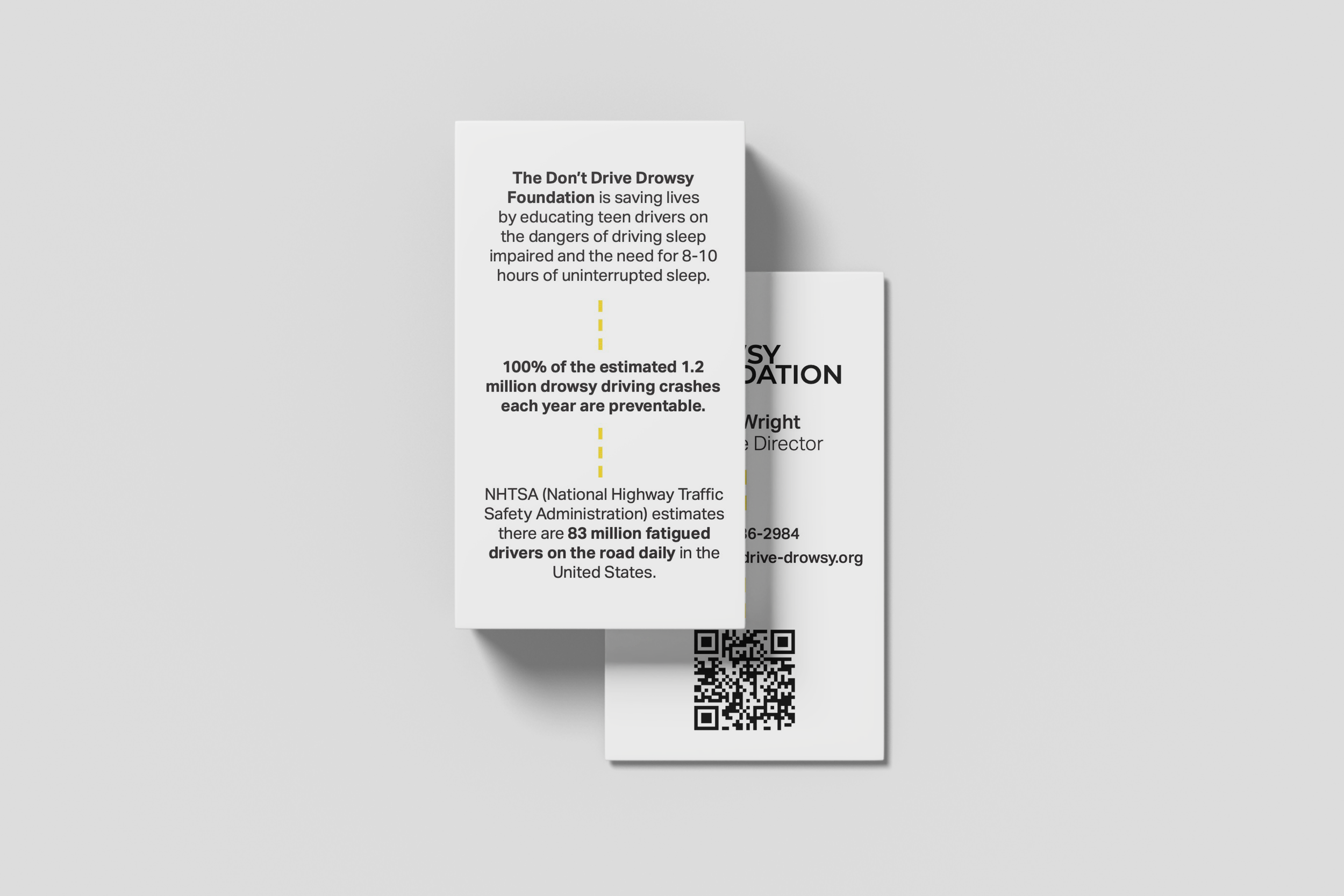
ROUNDING IT OUT
The cherry on top of all of this was the business cards. The founder of DDDF was so happy with her results that she wanted to show them off to everyone. I kept with the theme of a dotted line to represent a highway containing different drowsy driving stats for people to see. On the front, I placed a QR code so users can scan it to locate the website for a technical flourish.